Every big picture has a lot of little details, and we enjoy obsessing over little details. Our proven Point A Media Process starts with Discovery and develops into The Big Idea, which leads to really great things for our clients. We love adapting, enhancing and creating visual summaries (logos) that allow each client to clearly communicate their purpose, history and mission.
Better brand building begins at Point A Media.
![]()
As neighbors to East Texas' thriving poultry industry, we're excited to partner to promote Renewable Thermal Solutions' accessible and environmentally friendly technology.
![]()
Developing this logo for Nacogdoches Treatment Center gave us so much joy. The design conveys the idea that although the viewer's loved one may be going through changes, they will find support in the Treatment Center's gentle and loving environment. We are proud to partner to promote such an incredible home-grown organization!

Showcasing the spirit and unexpected surprises to be found by an off-road adventure group with deep roots in the piney woods of East Texas, the Sasquatch Off-Road Adventure Club logo makes a huge impact! From the deep tread of the tires to the elusive sasquatch stomping through the forest, this logo draws people in and takes them for a ride!

The A-Team is proud to be a part of branding the Index of Texas Archaeology with this new logo, conveying their high level of professionalism and dedication to distributing data utilizing innovative indexing and discoverability.
The extremely bold font is bound by a gradient and penetrated by the point, accentuating the A shape even further. The deep maroon earthtone is paired with a tan gradient that creates a flow (information) into shapes (categories and organization). The upward-facing point accentuates growth, continued success and elevated professionalism.

Point A Media is proud to partner with Powder River Lodge to brand a new man camp in the heart of the Powder River Basin.
This logo celebrates Wyoming pride with an updated depiction of the state's trademark bucking horse and rider. Bold swatches of gold add edge and action to the image. Powder River Lodge is in the wild West, especially when it comes to the race for positioning in the area, and the stylized font used for “Powder River” embraces the Western theme. The serif font also hearkens to timeless saloon imagery that lets people know this lodge is a place to blow off steam and recharge for another day. Placing rotated crowns on either side of “Lodge” creates the illusion of a truck grill. Showing “Lodge” in a strong block san serif font lets weary visitors know that their stop off on the trail includes modern amenities.
Need to make your brand stand out in the wild, wild west? We can do that!
Catholic churches, outposts, and ministries in the Nacogdoches area gather as one under Catholic Nacogdoches. The Holy Trinity symbolizes that unity, with the cross at the center of it all.
The use of blue evokes the Virgin Mary, a prominent figure in the Catholic faith. In color theory, blue is also associated with peace, while gold evokes a sense of permanence.
The more modern font of sans serif is used for “Catholic Nacogdoches” to relate to the present-day unity of the Catholic churches in East Texas.
The Rusche College of Business mission graphic utilizes the “L” shapes of “Learn, Launch, Lead” to create the corners of a box - a box you will definitely be thinking outside of when you complete your career preparation at SFA. The pattern created by the corner shapes symbolizes the college as a traditional program/place, with spaces in between to allow the flow of real-world experience, into and outside of the learning environment.
The “L” characters in the bold, san-serif font of “Learn, Launch, Lead” are modified to match the corners of the box and accent the beginning of each word by both starting and growing into them. The bottom black “L” representing “Launch” is actually the base the arrow launches from - projecting in a direction of general growth.
“Experience Business” is presented in a more friendly serif font, italicized to represent motion and experiential learning, leading to the result — the purple arrow. The color purple symbolizes power, wealth and ambition.
This conceptual branding solution is modern, simple and clean — distinct and easily identifiable at any size.
University Rental has served the Nacogdoches community for more than 35 years and the new owners wanted to rebrand to show customers what the future holds. This new mark reflects the new leaders' vision to bring style, fun and function to every event.

Point A Media created this logo for Axley & Rode, LLP, a dependable, dynamic, forward-thinking team that has served clients throughout East Texas for nearly 70 years.
The launch of the new logo coincided with the launch of a new website. Click here to see how it all comes together on the all-new AxleyRode.com.
Point A Media created this logo for SandJack, a Mt. Enterprise, Texas-based business. Click here to meet some of the whitetails at SandJack in this video for DeerFarmingTV.com.

The Bela BRand logo demonstrates Bela BRand as a reflection of BRazil. The straight line adds interest and adopts the streamlined, modern brand characteristics. Using the line to represent a mirror, this logo has a "through the looking glass" appeal. Stepping into Bela BRand transports the customer to Brazil.
The logo colors - "Little Black Dress" black and sunkissed bronze - let it blend with every shade in the bright palette of colors Bela BRand features.
The san serif fonts are contemporary, but friendly and accessible. The fonts give the logo a current appeal and the familiar text treatment adds additional credibility to the brand.
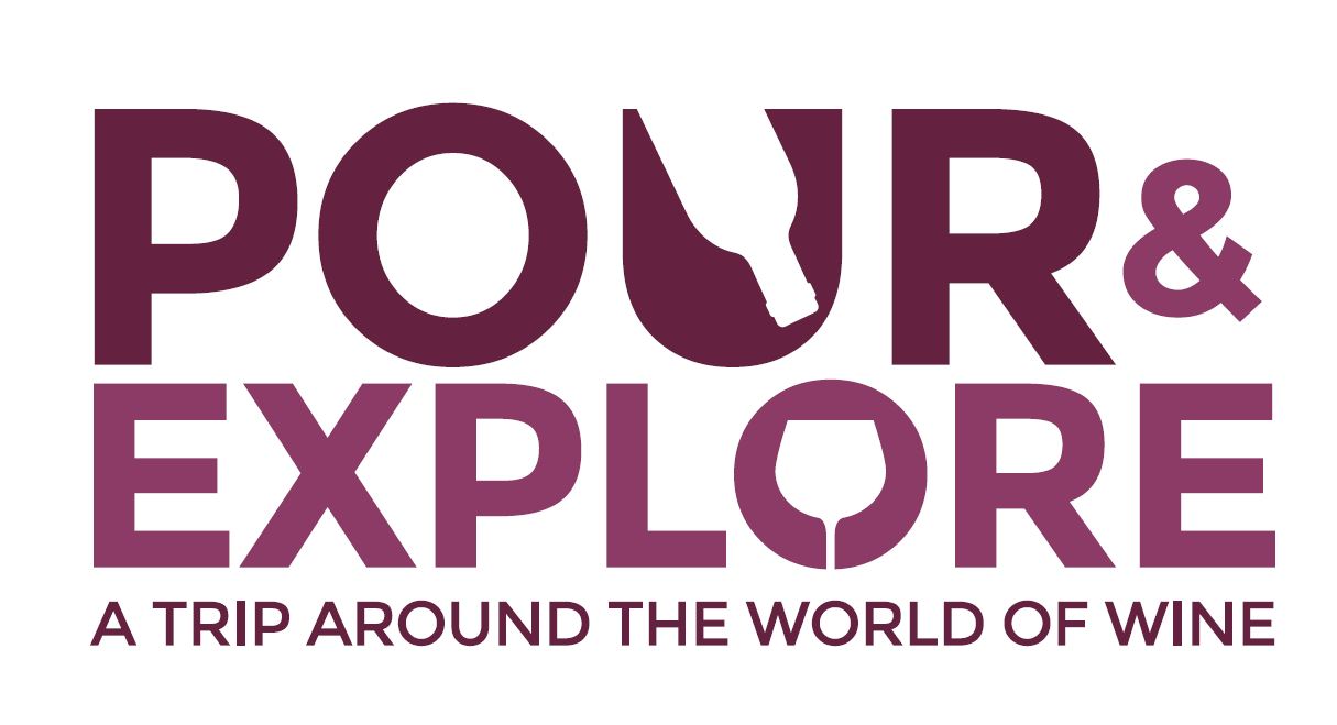
The Lufkin Convention & Visitors Bureau and Brookshire Brothers developed an exciting new series of events inviting wine learners and wine connoisseurs to visit Lufkin. The first event sold out! Thank you for choosing Point A Media as your partner to develop the Pour & Explore logo and promotional materials!
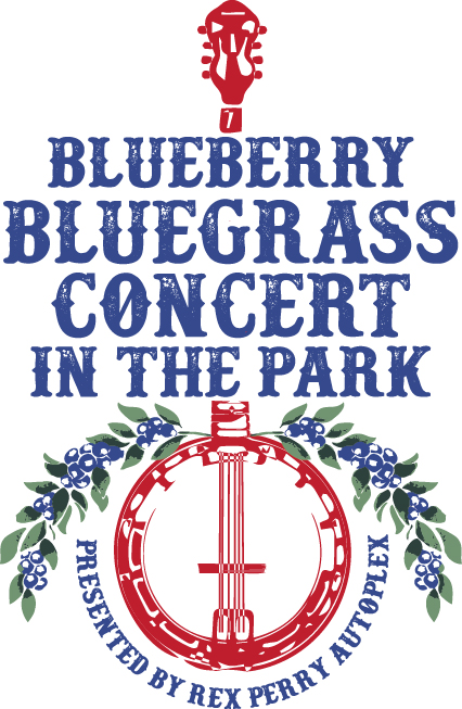
The Blueberry Bluegrass Concert in the Park presented by Rex Perry Autoplex was designed to extend the 26th Annual Texas Blueberry Festival presented by Brookshire Brothers. Adding to this already popular local event significantly increases the festival's economic impact by welcoming visitors from far and wide to spend an extra day (and hotel night) in Nacogdoches. Using a traditional palette of red, white and blue positions this event as a family-friendly, American as [blueberry' pie event. Traditional block lettering with a stamped appearance gives the logo an immediate/time-sensitive appeal reminiscent of classic concert posters. The banjo icon epitomizes the signature bluegrass sound and creates a natural curve to highlight the event's presenting sponsor. The soft branches of blueberries help tie the event to the annual festival.

This logo defines "Wingate" as a signature brand — a name that represents quality with a flourish that speaks to the customization Wingate Architectural Millwork Company offers clients. Cursive fonts like the one used in "WINGATE" elicit emotion from the personalized expression that comes with the handwritten word.
This logo speaks to the organization's individuality. The cursive style is slightly traditional, but slanted forward to evoke speed. This font plays with angles, curves and shapes that give prospective clients the idea that Wingate can create anything clients can imagine.
"ARCHITECTURAL MILLWORK" is defined by a structured, san serif font that speaks to the state-of-the-art facility in the company operates. Adding no flourish to "ARCHITECTURAL" shows that Wingate takes the technical side their business very seriously.
Including the circular saw as the "O" in "MILLWORK" illustrates Wingate's hands-on approach to the work the company does. While products are engineered in a modern way, Wingate's hands-on craftsmanship sets the company apart.
Wingate's new logo employs unfinished, raw wood tones that grow into a rich, warm, elegant finish. Neutral colors evoke sophistication and bring a feeling of warmth and wholesomeness to designs. Brown tones are commonly associated with the earth, wood and stone. Brown also speaks to dependability and reliability. Beige has the warmth of brown and the coolness of white, and, in most instances, beige is seen as a conservative color. In this application, the beige foundation lends a refined and traditional feeling to the overall design.

Point A Media? developed a new logo for Nacogdoches G.I. Consultants that combines a strong graphic element with a crisp, modern wordmark to create an instantly recognizable visual identity. The icon incorporates the letters "G" and "I" in the shape of the universal stick figure symbol. It signals that Nacogdoches G.I. Consultants is THE place to receive G.I. care. The logo uses a modern typeface that is both clean and understated, portraying a quiet, reassuring confidence. "G.I. Consultants" is set off in the darker blue, tying it visually to the graphic and positioning it as the prominent service conveyed by the organization.

Silver Spring started at Point A when developing the brand for their facility in Abilene, Texas. This flowing wordmark branches into a swirling graphic that evokes motion and liveliness. Silvery-gray was a deliberately obvious color choice that is buoyed by a fresh, vibrant and sleek blue. The calligraphy typeface suggests hand lettering, which personalizes the name "Silver Spring," while maintaining a distinct visual identity. The slab serif typeface used for the positioning text: "Rehabilitation, Health, Living," is an update of the common typewriter font. Accessing the familiarity of this typestyle, anchors this fluid logo, creating a modern, but comfortable design.

The identity for North Village Market, an exciting new development in Nacogdoches, communicates the legacy, experience, savvy and vision behind the project – independent of the literal aspects of the brick and mortar development. The name further separates the development from existing retail locations, while serving as a foundation for building an inclusive, family-oriented, welcoming, trustworthy and fully-supported brand that appeals to both potential tenants and future visitors. This logo is very representational and retro, yet the style is quite mainstream. It appeals to a broad range of prospective tenants and shoppers with a polished but homegrown feel. Small-town values meet family traditions in this hand-stitched seal of quality representing the founding family’s stamp of approval.

Nothing represents this iconic venue more prominently than the neon signage, complete with period accent scrollwork, that warmly welcomes all who visit charming downtown Lufkin. Branding this landmark as “The” Pines immediately identifies it as “The” one and only facility of its kind, “The” premier entertainment venue in the heart of East Texas and “The” place to be. The Pines logo commands immediate recognition and nostalgia. Parents and grandparents alike will want to recreate their favorite experiences with their kids and grandkids. Let’s start making new memories at The Pines!

Stephen F. Austin College of Fine Arts' 50th anniversary season of the University Series was more than a golden anniversary for the program; it was a year-long celebration of 50 years of bringing world class art to East Texas. The series logo needed to draw on this history, while promoting the program's advancement from its first season of two shows to more than 25 events (art exhibitions, concerts and theatrical performances presented by the Schools of Art, Music and Theatre, plus the Children's Performing Arts Series). Printing in matte metallic gold ink on white provided a major update to the traditional anniversary gold sheen and created a modern palette for these very special engagements.

Lufkin, Texas is nestled in the piney woods along the Angelina river. This logo concept focuses on the city's name and highlights nature with the palette of soft brown and variant greens. This logo is simple, modern and clean and will show well across a wide variety of media. This logo separated “Convention and Visitors Bureau” to help the organization redefine its brand as a separate entity, independent from the Chamber or other travel organizations in the area. The tree has depth and the modern take on the leaves accents progressive opportunities. This is also elegant and sophisticated, but still friendly and whimsical so it could read well in an upscale publication or on a family-friendly web site

Mast Motorsports is a lean, mean street, water and air machine engine builder. This logo has motion, speed and metal - everything the company delivers.
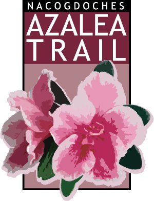
The Nacogdoches Convention & Visitors Bureau welcomes thousands visitors from around to world to explore the Nacogdoches Azalea Trail. This logo sets the tone for the annual events surrounding the colorful explosion of spring in East Texas. Vibrant pinks, rich reds, warm oranges and snowy whites decorate neighborhoods and the largest azalea garden in East Texas on the campus of Stephen F. Austin State University.
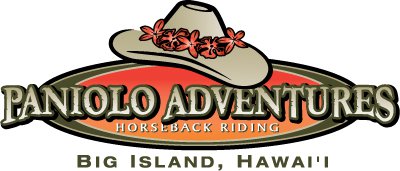
The Big Island, and especially North Kohala, is the home of the paniolo (Hawaiian cowboy). is the Premier Open Range Horseback Riding operation on the Big Island. In riding the open range of the Ponoholo Ranch, Paniolo Adventures guests get to experience what it was like to be a paniolo in the old days of North Kohala. The red lei lehua on the hat in the Paniolo Adventures logo is the traditional lei worn on the hats of the paniolos of the Big Island.

This logo promotes energy and happiness - the strong roofline denotes a safe haven, while the heart and figure represent the caring and stimulating environment of home. The traditional serif font, paired with a playful image, evoke a balanced experience of structure and opportunity. The graphic is placed between the words to signify the orderly, safe environment the St. Giles caregivers provide.

Coastal Plains' icon is strong and reflects an active, team-oriented service company. The logo also also includes the scale of services provided to the industry and gives prospective clients a feeling of belonging, security and establishment. Service, readiness, experience and access are vital to all business relationships and the mark illustrates this story for prospective clients with a solid, Texas centered brand that can be used in multiple applications - from frac tank stickers to mud flaps.
In addition to representing the natural, active, moving, physical, progressive, motivational, informative, environmental and conscious image, the Active Angelina logo was also developed to resonate in key community demographics, specifically persons ages 20-49. The brand should also stand alone – with a recognizable icon. Point A Media recommended a distinct palette of blue and green. Representing the brand using just two colors simplifies the logo and makes the effort seem uncomplicated – furthering the accessibility idea. This logo is friendly, active and nods toward the natural elements Angelina County offers. The “A coin” icon features paths that represent the walking, biking and hiking trails; rivers; and of course the strong roots of mature trees that a such a big part of Angelina County’s natural beauty. The round shape is all-inclusive and symbolizes the group efforts coming together to make the project whole. The font is strong, with soft, accessible edges, and italicized to signify forward motion.
![]()
Lufkin Convention and Visitors Bureau is celebrated the Christmas season with a fabulous four-day festival. 2015 marked the first-ever Yule Love Lufkin celebration. Point A Media worked with the Lufkin CVB to develop the event name and a logo that complements existing graphics used to promote the city as a year-round destination for visitors of all ages.
They aren't birds, they aren't planes... Up, up in the air, be on the lookout for Hydrex Environmental's all-new super Drone Division. This logo uses a modern custom font for "DRONE" that mirrors the cut elements shown in the stylized fixed-wing drone icon. We italicized "DRONE" to illustrate the speed that defines the instant capture technology, Hydrex Environmental's attentive team service, and quick project turnaround.
![]()
FermentaUSA worked with Point A Media to develop an American-facing brand for a company with a history of product development in India and sales and distribution in the US. We adapted the partner company’s established identity carrying forward elements of the Fermenta Biotech Limited logo while adding “USA” to the mark to project a unified global identity.


